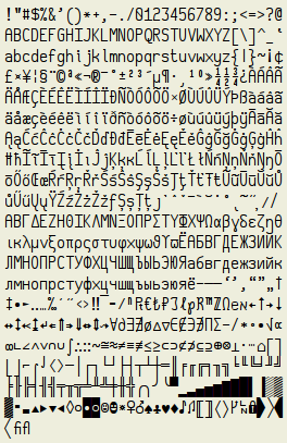
Sample

Luculent

2.0.0-b4b12eb282a3 — October 4, 2015
By Andrew Kensler

Luculent is a family of scalable (vector), monospaced, geometric sans-serif screen fonts designed for programmers. I began developing it in October 2008 after trying out as many of the available programming typefaces as I could find at the time. I wanted a pleasant looking typeface that could stand up to many hours a day of scrutiny. Though many good ones exist, none of them quite satisfied me or had every feature that I wanted. I decided to try making my own and the result was Luculent.

Features

Styles

A complete family of matching regular, italic, bold, and bold-italic styles is included for use in syntax highlighting. The bolds have increased stroke contrast and are designed to be heavy enough to make keywords stand out while still being legible. The italics change the forms of the lower case Latin and Cyrillic letters in ways that go beyond simple obliquing:

Styles

Clarity

The glyphs for each character (especially the most common ones) have been carefully chosen to be as distinct as from each other as possible. Periods and colons have slightly exaggerated dots. Curly braces are curly. Semicolons, commas and apostrophes have long tails, etc.

Coverage

The current release has 643 graphic characters providing complete coverage of the Adobe Latin 3 ("Pro") set and all graphic HTML 4 named character entities. Code pages covered include ISO-8859-1, ISO-8859-2, ISO-8859-3, ISO-8859-4, ISO-8859-10, Windows-1252, MacRoman (minus logo), DOS CP437, and KOI8-R. The DOS page includes common box drawing characters for terminal applications. Basic support for Powerline is included as well as many additional symbols:

Coverage

Crisp

Each font is meticulously hinted and contains an average of 47KB of hand crafted TrueType bytecode for the crispest possible rendering via strong grid fitting. Super high DPI displays are nice but there are still many older systems that benefit greatly from hinting. Autohinting software is improving all the time, but still seems to have problems with things like strokes changing thickness between some characters, characters that are nearly symmetrical (e.g., "m") becoming asymmetrical, lengths that should be equal becoming unequal (e.g., the arms of the plus sign), etc. Hand hinting gives complete control over this.

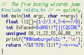
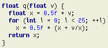
Small sizes. For packing as much code onto a screen as possible, the hinting supports legible rendering at sizes as small as 5×11 pixels (including spacing and line leading):

Small Sizes

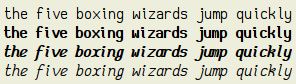
Aliased rendering. If the combination of antialiasing with full hinting isn't crisp enough (or one simply likes pixel fonts), the upright regular and bold variants are superhinted for pleasant aliased rendering at their smaller sizes:

Aliased

Cross platform. The fonts are designed to render as crisply as possible on FreeType, Windows, and OS X systems. The hints include special logic to reduce some of the fuzziness that Cleartype on Windows can introduce. For OS X, which normally ignores hints when antialiasing, a set of fonts "pre-hinted" for various sizes is provided. When correctly matched to the font size the result should be as crisp as any other platform. These may also be useful for reducing moiré effects from sub-pixel positioning in DirectWrite on Windows.

Download

The current version of Luculent is 2.0.0-b4b12eb282a3, last updated on October 4, 2015, and is distributed under the terms of the Open Font License, Version 1.1. with Reserved Font Name ‘Luculent’. Currently, it is available in three forms:

Standard

A normal family of four TTF files that include hinting instructions. Use this version for FreeType, for Windows or OS X with aliased rendering, or for Windows with GDI-style rendering. If you are uncertain which to use or are comfortable with how your platform handles hinting, just use this version.

Web

For web use, you can also download the font in WOFF form and redistribute it on your website. These files are equivalent to the standard TTF versions, but in compressed form, and the conversion was done using the Zopfli compressor to shrink them further.

Prehinted

A set of families of four TTF files each numbered for a range of point sizes and logical resolutions. These lack hinting instructions and instead have had them already applied to the vector outlines targeting the given size. If your system tends to ignore hinting, this may give you crisper results when exactly matched to the point size. These may also be installed alongside the standard version as they register as different (numbered) fonts. However, you should select only one of these, choosing the DPI that most closely matches your OS' logical resolution; typically this is 72 DPI on OS X and 96 DPI on Windows. The point sizes cover the 9px to 19px range.

Contact

If you have any questions, comments, or suggestions regarding this typeface (or simply wish to tell me about something nifty you do with it), please feel free to contact me via e-mail using the font name at this domain as the address.

History

2.0.0-b4b12eb282a3 — October 4, 2015
Added 232 new graphic characters to now cover ISO-8859-2, ISO-8859-3, ISO-8859-4, ISO-8859-10, Adobe Latin 3, and HTML 4 named entities. Squared tops of i and j in upright versions. Realigned less common math symbols. Made many other small tweaks and fixes.
1.0.0-845fa02f9341 — March 7, 2014
Initial release with 411 graphic characters covering ISO-8859-1, Windows-1252, MacRoman, DOS CP437, and KOI8-R, and powerline.