Pixel Art Palettes for Free
Ever since I discovered DawnBringer’s 16-color and 32-color palettes and later Arne’s, I’ve been thinking about what makes a good small but general-purpose palette (DawnBringer’s palettes are pretty neat, but they’re a bit desaturated and lacking in purples for my taste – you couldn’t do Monkey Island with them). So far as I know, their palettes were carefully selected by hand. But I write code, so I took it as a challenge to see if I could create a short program that would automatically generate good palettes from scratch. Here are the results of my experimentation.
Evaluating a Palette
The first question then, is how do you define the “goodness” of a potential palette. There are lots of good optimization algorithms out there (I used simulated annealing for this project), but they all need some quantitative criteria to optimize for. In the end, I settled on the combination of two methods.
First, I tried to maximize the distance between the closest two colors in the palette, as defined by the CIE DE 2000 color difference metric. So far as I know, CIE DE 2000 is pretty much the best analytic model there currently is for how humans perceive the difference between two colors. If you ever need to implement it, I highly recommend reading Sharma et. al’s paper. My first implementation had some bugs that their notes and test data helped me flush out.
Second, I tried to minimize the root mean squared error between evenly sampled points on the RGB cube and their closest corresponding matches in the palette (again, with error in this case being defined as the CIE DE 2000 color difference).
Both of these methods will disperse the colors on the palette, but they do so slightly differently. Maximizing the distance between the two closest tends to lead to the palette using colors from on the faces of the RGB cube; these highly saturated colors are measured as being more different from each other. On the other hand, minimizing the root mean squared error leads to choosing more conservative, duller desaturated colors from the interior since each can cover more volume of the cube.
I experimented with different ways of combining them. Palettes with the greatest ratio between the two turned out to be quite good at reducing mean squared error when quantizing my test suite. However, optimizing for the greatest difference between the values from the two methods proved better for the simulated annealer in avoid getting stuck in local maximum (and often found palettes with excellent ratios, anyway). In the end, I had my program optimize for the difference while selecting the best palette it came across by ratio. Interestingly, the palettes with the best ratios were all pretty constant at around 2.34 to 2.37, regardless of palette size.
16-Color Palette
So what turned up? Here is the best-scoring 16-color palette that my programs created. The colors in the table are named from the closest matches in the xkcd color list according to CIE DE 2000. If you like, you can also download this as a GIMP palette or grab the following image for use with an eye dropper tool in your favorite art program:
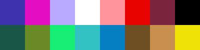
| #3f32ae | rgb(25.0%, 19.5%, 68.1%) | sapphire | |
| #e30ec2 | rgb(88.9%, 5.8%, 75.9%) | hot magenta | |
| #baaaff | rgb(72.8%, 66.4%, 99.8%) | pale violet | |
| #ffffff | rgb(100.0%, 100.0%, 100.0%) | white | |
| #ff949d | rgb(99.9%, 58.2%, 61.7%) | rose pink | |
| #e80200 | rgb(90.7%, 0.8%, 0.0%) | red | |
| #7a243d | rgb(47.8%, 14.2%, 24.1%) | wine | |
| #000000 | rgb(0.0%, 0.0%, 0.0%) | black | |
| #195648 | rgb(10.0%, 33.6%, 28.3%) | dark blue green | |
| #6a8927 | rgb(41.6%, 53.9%, 15.4%) | mossy green | |
| #16ed75 | rgb(8.9%, 92.9%, 45.9%) | minty green | |
| #32c1c3 | rgb(19.7%, 75.6%, 76.3%) | topaz | |
| #057fc1 | rgb(2.2%, 49.9%, 75.8%) | cerulean | |
| #6e4e23 | rgb(43.3%, 30.7%, 14.0%) | mud brown | |
| #c98f4c | rgb(78.7%, 56.2%, 30.0%) | dull orange | |
| #efe305 | rgb(93.5%, 89.0%, 2.3%) | piss yellow |
32-Color Palette
Likewise, here is one of the best-scoring 32-color palettes. This too is downloadable as a GIMP palette. I like how it found sets of both cool and warm “greys”:
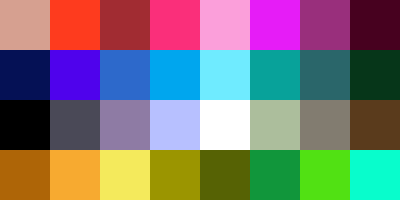
| #d6a090 | rgb(84.0%, 62.6%, 56.4%) | pinkish tan | |
| #fe3b1e | rgb(99.6%, 23.1%, 11.8%) | orangey red | |
| #a12c32 | rgb(63.3%, 17.5%, 19.6%) | rouge | |
| #fa2f7a | rgb(98.0%, 18.5%, 47.7%) | strong pink | |
| #fb9fda | rgb(98.2%, 62.4%, 85.5%) | bubblegum pink | |
| #e61cf7 | rgb(90.1%, 11.1%, 96.8%) | pink/purple | |
| #992f7c | rgb(59.9%, 18.6%, 48.7%) | warm purple | |
| #47011f | rgb(27.9%, 0.5%, 12.5%) | burgundy | |
| #051155 | rgb(2.3%, 6.7%, 33.3%) | navy blue | |
| #4f02ec | rgb(31.2%, 0.9%, 92.3%) | blue/purple | |
| #2d69cb | rgb(17.7%, 41.3%, 79.5%) | medium blue | |
| #00a6ee | rgb(0.3%, 64.9%, 93.3%) | azure | |
| #6febff | rgb(43.5%, 91.9%, 99.9%) | robin’s egg | |
| #08a29a | rgb(3.2%, 63.6%, 60.5%) | blue/green | |
| #2a666a | rgb(16.7%, 40.1%, 41.5%) | dark aqua | |
| #063619 | rgb(2.4%, 21.2%, 10.0%) | dark forest green | |
| #000000 | rgb(0.0%, 0.0%, 0.0%) | black | |
| #4a4957 | rgb(29.0%, 28.6%, 34.3%) | charcoal grey | |
| #8e7ba4 | rgb(55.5%, 48.3%, 64.4%) | greyish purple | |
| #b7c0ff | rgb(71.7%, 75.3%, 99.8%) | light periwinkle | |
| #ffffff | rgb(100.0%, 100.0%, 100.0%) | white | |
| #acbe9c | rgb(67.4%, 74.4%, 61.2%) | greenish grey | |
| #827c70 | rgb(50.9%, 48.8%, 44.0%) | medium grey | |
| #5a3b1c | rgb(35.2%, 23.3%, 11.0%) | brown | |
| #ae6507 | rgb(68.2%, 39.6%, 2.8%) | umber | |
| #f7aa30 | rgb(96.8%, 66.4%, 19.0%) | yellowish orange | |
| #f4ea5c | rgb(95.5%, 91.5%, 36.0%) | yellowish | |
| #9b9500 | rgb(60.6%, 58.4%, 0.4%) | pea soup | |
| #566204 | rgb(33.9%, 38.4%, 1.7%) | mud green | |
| #11963b | rgb(7.0%, 58.8%, 23.1%) | kelley green | |
| #51e113 | rgb(31.7%, 88.0%, 7.6%) | toxic green | |
| #08fdcc | rgb(3.5%, 99.1%, 79.8%) | bright teal |
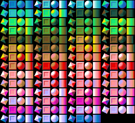
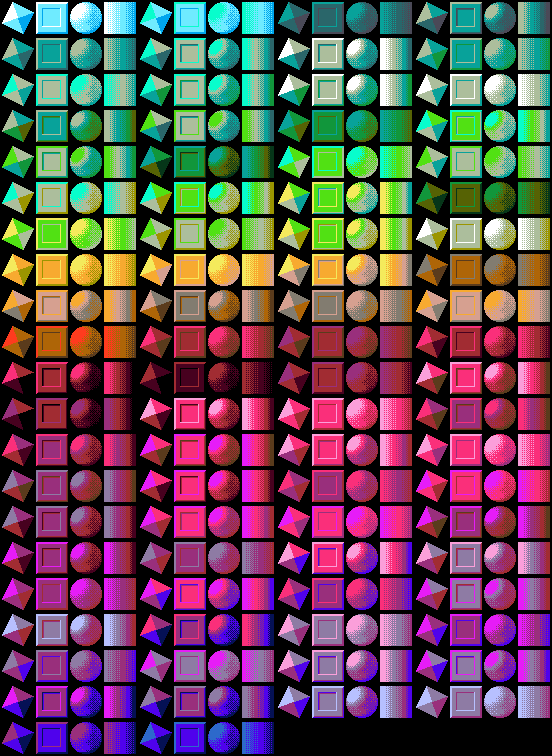
Color Swatches
I’m not much of a pixel artist but I did want to do some tests and see what color combinations might be possible with these palettes. So approaching this from the technical side, I drew some small 3- and 4-level greyscale swatch templates and wrote a program to try to find reasonably similar sets of colors (once again, by CIE DE 2000) and recolor the template accordingly.
Here’s what it came up with using the 16-color palette. Some of these seem a bit off, particularly the pale violet and red ones. But otherwise, most look pretty reasonable to me:
And here are the combinations it found for the 32-color palette:
Remapping Images
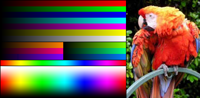
I also tested by remapping many images, including hundreds of screen shots from old 90’s games. But sticking to free images, here’s a color chart and parrot, courtesy of Wikipedia, and used as a palette test there:
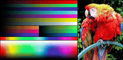
Remapped to the 16-color palette with an 8x8 positional dither:
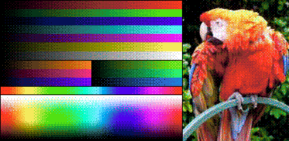
And the same thing, but for the 32-color palette:
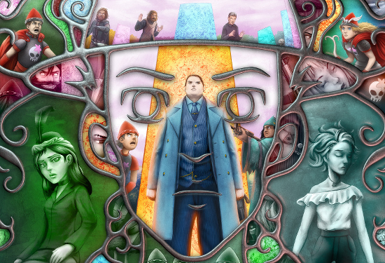
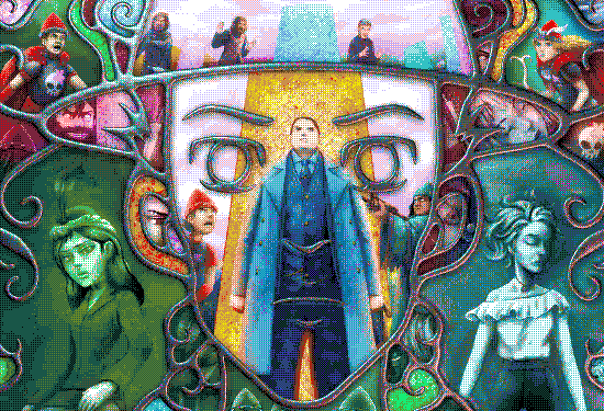
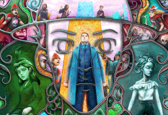
For a test on some real world art, here’s a webcomic image adapted from Book 3 - Page 119 of Erfworld, written by Robert T. Balder, drawn by Xin Ye, colored by Lauri Ahonen, and available to use under CC 3.0 NC-SA. It has a broad range of colors, monochromatic regions, and a trickyish pink wash:
This time, I remapped it using simpler 2x2 positional dither which is a little closer to how a human might dither an image by hand. The color mixes are more straightforward this way, at the expense of increased banding. Here that is with the 16-color palette:
And with the 32-color palette:
Seems reasonable to me! I’ve still got more to say on palettes, but I’ll leave off here for now. Perhaps some day I’ll run my programs to try generating 24- and 48-color palettes, too. In the meantime, you’re welcome to use these palettes in any way you wish (and if you do, I’d love to hear about it)!