More on Palettes
I was recently asked a pair of questions regarding palettes and my previous posts on them. First, I was asked about what a 48-color palette generated by my palette generator algorithm would look like. Secondly, a different person asked me what my mapping approach would make of the extended Pico-8 palette with the 16 additional colors that have been added.
48-Color Palette
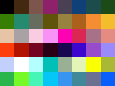
First up, I dusted off the palette generation program and gave it lots of compute time to explore 48-color palettes and here is the result. Once more, you can download this as a GIMP palette or use the following image for with an eye dropper tool in your favorite art program:

| 000000 | rgb(0.0%, 0.0%, 0.0%) | black | |
| 43290f | rgb(26.3%, 16.0%, 6.2%) | dark brown | |
| 7d554d | rgb(49.0%, 33.6%, 30.1%) | cocoa | |
| 8d226b | rgb(55.3%, 13.4%, 42.0%) | red violet | |
| 4a4053 | rgb(29.2%, 25.0%, 32.4%) | dirty purple | |
| 0f4078 | rgb(6.2%, 25.1%, 47.0%) | darkish blue | |
| 1c4c4b | rgb(11.3%, 29.9%, 29.5%) | dark teal | |
| 1d4b18 | rgb(11.5%, 29.6%, 9.7%) | british racing green | |
| 377f04 | rgb(21.7%, 49.8%, 1.7%) | dark grass green | |
| 248b6e | rgb(14.3%, 54.5%, 43.0%) | viridian | |
| 666c5e | rgb(40.2%, 42.2%, 36.9%) | medium grey | |
| 5f540a | rgb(37.4%, 33.1%, 4.1%) | olive brown | |
| 97833f | rgb(59.2%, 51.4%, 24.8%) | dark khaki | |
| ab601b | rgb(67.0%, 37.8%, 10.6%) | raw umber | |
| f58e32 | rgb(95.9%, 55.7%, 19.9%) | faded orange | |
| f3bd2d | rgb(95.0%, 73.8%, 17.7%) | golden rod | |
| e8c4a6 | rgb(90.7%, 76.9%, 65.0%) | light peach | |
| aaa1a5 | rgb(66.5%, 62.9%, 64.5%) | pinkish grey | |
| facce1 | rgb(98.0%, 80.0%, 87.9%) | light pink | |
| f892f6 | rgb(97.1%, 57.2%, 96.4%) | lavender pink | |
| fb03b3 | rgb(98.3%, 1.3%, 70.3%) | bright pink | |
| db2753 | rgb(85.8%, 15.4%, 32.5%) | lipstick | |
| a77188 | rgb(65.4%, 44.2%, 53.3%) | mauve | |
| e48b82 | rgb(89.3%, 54.4%, 50.9%) | blush | |
| fd3d0e | rgb(99.1%, 24.2%, 5.8%) | red orange | |
| b21401 | rgb(69.6%, 8.1%, 0.5%) | rust red | |
| 740321 | rgb(45.6%, 1.2%, 13.1%) | wine red | |
| 290016 | rgb(16.2%, 0.2%, 9.0%) | dark plum | |
| 180750 | rgb(9.4%, 2.8%, 31.3%) | dark indigo | |
| 3c06ce | rgb(23.5%, 2.3%, 80.9%) | ultramarine blue | |
| 984bca | rgb(59.7%, 29.6%, 79.0%) | purply | |
| 9a8afa | rgb(60.2%, 53.9%, 97.9%) | lavender blue | |
| c4d0fc | rgb(76.8%, 81.3%, 98.6%) | light periwinkle | |
| ffffff | rgb(100.0%, 100.0%, 100.0%) | white | |
| b3ffff | rgb(70.2%, 100.0%, 100.0%) | light cyan | |
| 00c0b8 | rgb(0.0%, 75.2%, 72.0%) | topaz | |
| 9ab095 | rgb(60.4%, 69.1%, 58.5%) | greenish grey | |
| e2f5b7 | rgb(88.6%, 95.8%, 71.6%) | light khaki | |
| faff04 | rgb(97.9%, 100.0%, 1.7%) | yellow | |
| a9b835 | rgb(66.2%, 72.0%, 20.9%) | sick green | |
| 2ab64d | rgb(16.6%, 71.5%, 30.3%) | shamrock | |
| 77f827 | rgb(46.7%, 97.1%, 15.4%) | bright lime green | |
| 45f6b7 | rgb(27.3%, 96.2%, 71.8%) | light greenish blue | |
| 04c7f8 | rgb(1.8%, 77.9%, 97.1%) | bright sky blue | |
| 3895ef | rgb(22.2%, 58.5%, 93.4%) | dark sky blue | |
| 418898 | rgb(25.5%, 53.4%, 59.5%) | teal blue | |
| 6c7192 | rgb(42.5%, 44.4%, 57.3%) | grey purple | |
| 095ffc | rgb(3.7%, 37.3%, 98.7%) | azul |
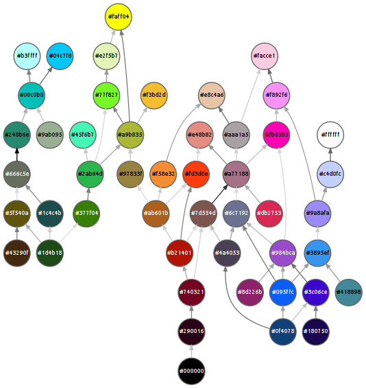
And here is the mapping that my palette mapping tool produced for it. One new feature that I added to my mapping tool while doing this was to color code the edges between linked colors. The two “closest” colors are shown with a black edge between them, while the two “farthest” but still linked colors are shown with a light grey edge. All the other edges are shaded somewhere in between depending on where they fall on that scale. Note that this doesn’t mean that two colors linked by a light grey line are necessarily very dissimilar; it just means that other pairs of colors linked in the map are considered closer by the CIEDE2000 formula.

Additional Mappings
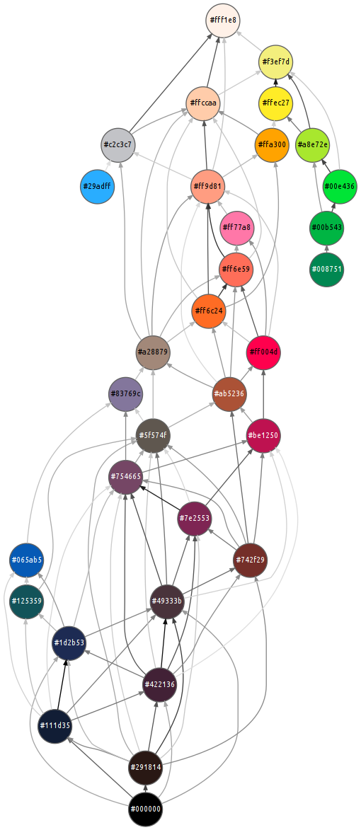
Next up, there was the question about what the map of what the extended 32-color PICO-8 palette looks like. Here’s the result:

One thing this shows is that the light blue color is still the most unique and isn’t particularly close to any other color in the palette. Since this sets the upper threshold on how close colors must be in order to be connected in the map, the result is a fairly messy looking map since lot’s of pairs of colors are closer to each other than that light blue is to anything else. That means that this palette is something of a failure case for my mapping algorithm. Still, I hope that the new shading of the edges will help to suggest which pairs of colors are actually more strongly connected.
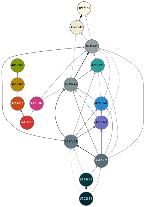
Finally, just for fun, I was curious about the Solarized palette that is popular with many for terminals and text editors. The mapping program definitely manages to find the desaturated spine of the palette:
